How To: Create A Comic/Part 5: Layout
Once you have your story and your images, it’s time to put them all together to create your comic.
There are a few ways of doing this, and it all depends on what kind of comic you’re putting together.
If you’re only doing a single-page comic or a comic strip, then a simple image-editing program like Photoshop or GIMP could be used. But if you’re doing a multi-page comic, then it would be best to use a publishing program such as Microsoft Word or Microsoft Publisher or the now-defunct Comic Book Creator. You can even use a multimedia presentation program such as Microsoft PowerPoint if you don’t mind the non-traditional screen-shaped format.
No matter the program you use, the goal is still to put together screen images and text to tell your story, and do it in a way you feel comfortable working with. (The latter part is important if you decide to do a regular series as you’d be using that program regularly.)
Traditional Comic Book Layout:
If you open up a traditional mainstream comic book, you’ll see that it’s divided into these segments…
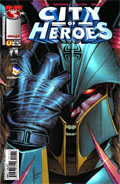
- Front Cover - This is the selling point of the comic. This is the first thing that people see and this is usually what draws the reader in. What is seen on the cover has to be striking or shocking or titillating. It doesn’t have to be connected to the main story, and, in fact, sometimes celebrity artists will be brought in to create a special cover for just such a reason.
- Introduction/Summary/Title Page - This is where the writer can introduce the character or comic, and/or get the reader caught up on events leading to the story in the issue, and/or put in the title of the main story, the credits, and all of the legal disclaimers instead of having to sneak it into the main story itself.
- Main Body - No explanations needed, other than to say that this is where the main story is told.
- Advertising - Again, no explanations needed, other than to say that when you’re dealing with a for-profit operation they have to pay the bills somehow, and advertising sponsorships allow them to keep the price of the issue “relatively low”. (If you call $3.99 for 18 pages “low”, that is.)
- Back Story - Every so often a second or “back story” is needed to fill in space, especially when the main story comes up a little short. Traditionally this could be anything from a supplemental story featuring a different cast of characters to a text-based story.
- Notes/Letters/Extras - Any additional information or editorials from the author can be put here, or maybe some additional artwork, or letters from the readers. This could also be where you’ll find hints to the next issue.
- Back Page - This could be reserved for ads, a teaser for the next issue, or even artwork as a bleed-over from the cover. (More than likely, though, this part is used for ads.)
Fan-Made Comic Book Layout:
So… let’s see how these segemnts apply to your fan-made creation…
Cover:
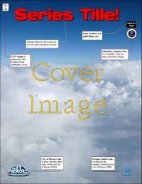
This is as essential to your comic as the main story itself. While it doesn’t have to be the first thing that you come up with, it shouldn’t be taken lightly either because this is what will often draw people in to read the finished product.
The cover should reflect something about the story inside it. It doesn’t have to be a direct scene. It could even just be a scene featuring one of the main characters.
If you’re a good artist, or if you know someone who is, you can design the cover image and then add the title banner and other additional features later. This would actually be a lot better than simply putting up a screen image and have that serve as the cover, especially when the size of the cover page is larger than the screen image you have in mind.
Put some time and some serious thought into designing the title banner for your series. This should be one of the constants that people will easily recognize. The look of your title banner should fit with a key quality of your series, your group, or your main character. For instance, use bold lettering for strength. You may want to incorporate a logo or symbol of your character or group into the title to give it a unique distinction.
Some people make the mistake of replicating a mainstream comic book design right down to adding a price tag, barcode, and a “Comics Code Authority” seal. Putting in a price tag could result in some legal complications, especially since these are supposed to be fan-made not-for-profit publications. (See the LEGAL ISSUES segment for more about this.)
As for the CCA seal, this is the comic equivalent of the “Good Housekeeping Seal”. You have to actually submit your comic to the Comics Code Authority for approval before you’re legally permitted to use their seal on your publication. It is heavily suggested that you leave these things out, or at the very least come up with something similar in its place. The City of Comic Creators have a lookalike stamp for its members for just such a purpose if you feel so compelled to have one for the sake of nostalgia.
One last thing about creating a cover… it doesn’t have to be the first thing you work on, but it has to be just as important as the main story itself. Remember: this will be your biggest selling point for your comic.
Introduction/Summary/Title Page:
This is an optional page, allowing you to introduce your character to the reader, as well as putting in cast credits, editorial credits, legal disclaimers, and the like. You don’t need to have this in your comic, but it does allow you to have all of that information without having to slip it in with the main body of the story.
Consider this: if someone who has never read your comics before came across one of your issues, how do you think they would react to your story and characters without knowing anything pertinent about what lead up to that issue? Would they catch on, or would they be somewhat lost early on.
The cover may be the hook, but it’s the story that brings them back for more, and the introduction or summary page will bring them into that story.
Main Body:
Obviously this is the main part of the comic, where you will tell your story one image at a time and one page at a time.
When “blocking” scenes, or laying images out on the page as you want the reader to see it, remember the rules about images in that you can make a large image smaller, but you can’t make a small image larger without losing quality.
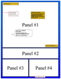
Each page can be divided up into panels. The number and size of these panels is up to you and the size of your publication. If you’re doing something the size of a traditional paper page, then you could have six or eight or even ten panels on each page. You can use the size of the panel to emphasize a scene, so the more dramatic the scene, the larger the panel.
Dialogue can be handled in two ways. If the only dialogue is your character’s narration, then you can use narration boxes. However, if you have more than one person talking, then it’s best to use dialogue or speech balloons.
Speech balloons can be any size or shape. You could use either a square or rounded balloon (as seen in the example on the right) with the “tail” pointing at the character making the conversation. You could also use a combination of balloon shapes depending on the type of dialogue. So, for instance, you could have rounded balloons for normal speech, and square balloons for sounds coming from a radio or TV or communicator.
This is also where the size of the frames on each page is important, because the smaller the frame, the less room you have for dialogue.
A few key tips about speech balloons:
- Use a font and size that the reader can actually read and comprehend. While a creepy-looking font may look cool for your creepy-looking character, it looses its punch if your character is saying something that the reader can’t read because the size and shape of the font makes it difficult. The only exception to this is if you WANT your readers to not understand the dialogue so as to share the character's frustration.
- Try not to place a balloon over a part of the scene you want the readers to see. This includes placing it in front of the character itself. Sometimes this cannot be helped, but you should do what you can to minimize this.
- Place the tail end of the balloon towards the source. In other words, if the source is a human character, point the tail of the balloon towards the character’s head. If the source is an object, point the tail end towards the object.
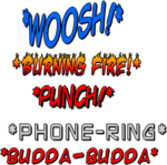
Another helpful tool is the use of visual effects. Since this is a visual medium and not a fully-multimedia one, you may need to visualize sound effects, such as a phone ringing, or a communicator chirping, or the ding of a doorbell. Sadly, an over-reliance on these can also turn your comic into a Saturday Morning cartoon. If you’re dealing with a lot of action, it’s probably best to keep the visual effect to a minimum.
Every so often you may need to include a footnote to your production. This is to reference something that cannot be explained in the issue. For instance, if something happened in an earlier issue, or in another comic entirely, adding a footnote will let the reader know to turn to that other comic to better explain what happened.
Unlike a written page, though, where footnotes are added at the bottom of the page, footnotes in a comic need to be placed within the same panel so as to not confuse the reader.
Workbook
If you’re putting your comic together through programs like Microsoft Publisher or any of the Office programs, a helpful tip is to come up with a separate “Workbook” file for some of your most common visual effects, speech balloons, narration boxes, and other items, including the title logo. This will make things easier working with an ongoing series as you’d have a consistent format for these effects that you can just copy-and-paste.
Advertising:
While commercial comics rely on advertising (as well as subscriptions) to pay the bills, fan-made comics, especially when dealing with MMORPGs like City of Heroes, are contractually obligated to not make money off their work. (See the LEGAL ISSUES segment for more about this.)
That doesn’t mean that comic creators can’t have any kind of advertising. Ads for the MMO in question, or to promote another fan-based service or website connected to that MMO, are fine as long as no real money is involved in the promotion. You can also have spoof advertising, promoting fictional stores or products within the game or within your own story. Does your character eat at a favorite restaurant in your story? Do a shameless plug for it. Is your antagonist a corporate CEO? Do a slick ad for the company.
This Wiki Resource has several of these advertisements, both in full-page and half-page format for comic creators to use.
Ad placement should be either at the beginning of the issue ("behind" the cover), the end (preferably the back page), or in the pages between two scenes. Don’t break up a scene with ads if you can help it as it would only confuse the reader.
Back Story:
A back story or second story is often brought in to fill out an issue when the main story runs a few pages short. When a publisher sets aside twenty-four pages for an issue and the talent can only come up with twelve, then they have to scramble to fill in the other pages with something, and preferably not with advertising.
Since this is an online not-for-profit fan-based comic, filling space really isn’t a problem for you, so putting in a backstory should only be brought in if you so desire.
Notes/Letters/Extras:
Another way publishers pad an issue is the use of editor’s notes, letters to the editor, or supplemental images that help explain certain subjects to the readers.
For instance, if your story takes place in a school, you could create a phony class syllabus, or the headline of a school newspaper. Maybe a letter from the school’s headmaster welcoming the student, or a school map to show the various buildings.
Does your story have some backup character or a guest star? You could use this space to do a quick biography. Maybe your readers don’t know who that particular character is. This is your opportunity to educate the readers.
Back Page:
Traditionally, comic pages had to be even-numbered for printing purposes. So if you had a cover, you also had to have a back page, and something more for you to fill (often with ads). Current comic creators find it easy to forget about this page because you don’t need to print a back cover, and therefore you don’t need to worry about filling the space for it.
However, if you want to give your comic the feel of a mainstream publication, then you should certainly look into coming up with a back page, even if it’s just to put in an ad.
Putting It Together
Putting all these elements together can take time, which is often why some creators work with a script instead of handling it freehand.
Remember that this is largely a visual medium, which means you should let the images tell most of the story.
The old adage is true; a picture is worth a thousand words.
Moving Onward
Okay, so you put it all together… what now?


